7 tips to improve customer experience at e-commerce checkout
The checkout process is a critical touchpoint that can make or break a customer experience. A smooth and efficient checkout can increase conversion rates and customer satisfaction. A long and confusing one can result in cart abandonment and lost revenue.
In this article, we will discuss seven ways to improve the e-commerce customer experience at the checkout.
#1. User-friendly and intuitive design
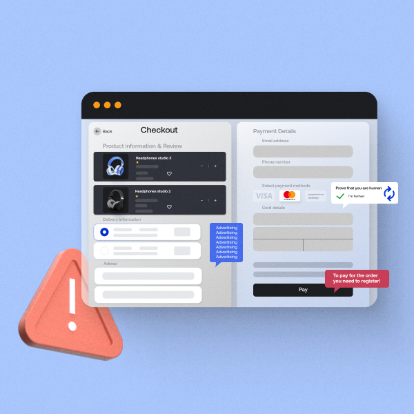
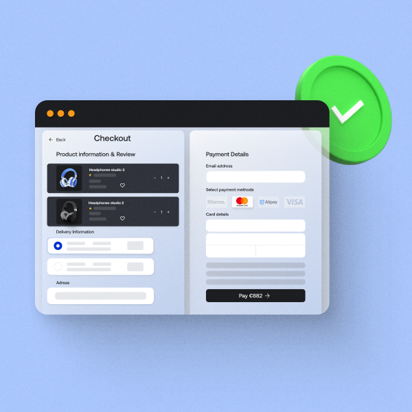
A cluttered and confusing checkout page can frustrate customers and cause them to abandon their purchase. To prevent this, the e-commerce checkout process should be as simple and intuitive as possible. Here is what you can do:
- Minimum steps: Limit the number of steps required to complete a purchase. A single-page checkout is ideal, but if multiple pages are necessary, ensure they are logically ordered and easy to navigate.
- Clear instructions: Provide clear instructions at each step, with noticeable buttons and easy-to-read text. Avoid jargon and keep the language simple.
Progress indicators: Use progress indicators to show customers where they are in the checkout process and how many steps remain.
#2. Guest checkout option
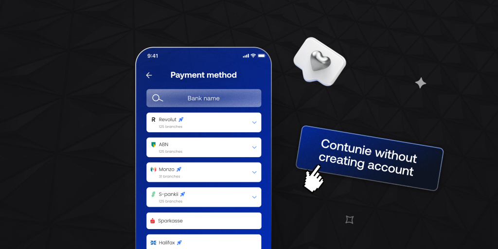
Forcing customers to create an account before completing a purchase can be a major annoyance. Offering a guest checkout option can significantly improve the e-commerce customer experience, particularly for first-time buyers or those in a hurry. There are two aspects to consider:
- Simple data entry: Allow customers to enter only essential information at e-commerce checkout. Optional fields should be clearly marked, and any mandatory fields should be justified by their importance to the transaction.
- Account creation encouragement: Offer the option to create an account after the purchase. Highlight the benefits of this step, such as order tracking, faster future checkouts, or special discounts.
#3. Mobile-friendly e-commerce checkout
With the increasing use of smartphones for online shopping, a mobile-optimised checkout experience is essential. A mobile-friendly design ensures that customers can quickly complete their purchases regardless of the device they are using:
- Responsive design: Ensure the checkout page is fully responsive and adapts to different screen sizes and orientations.
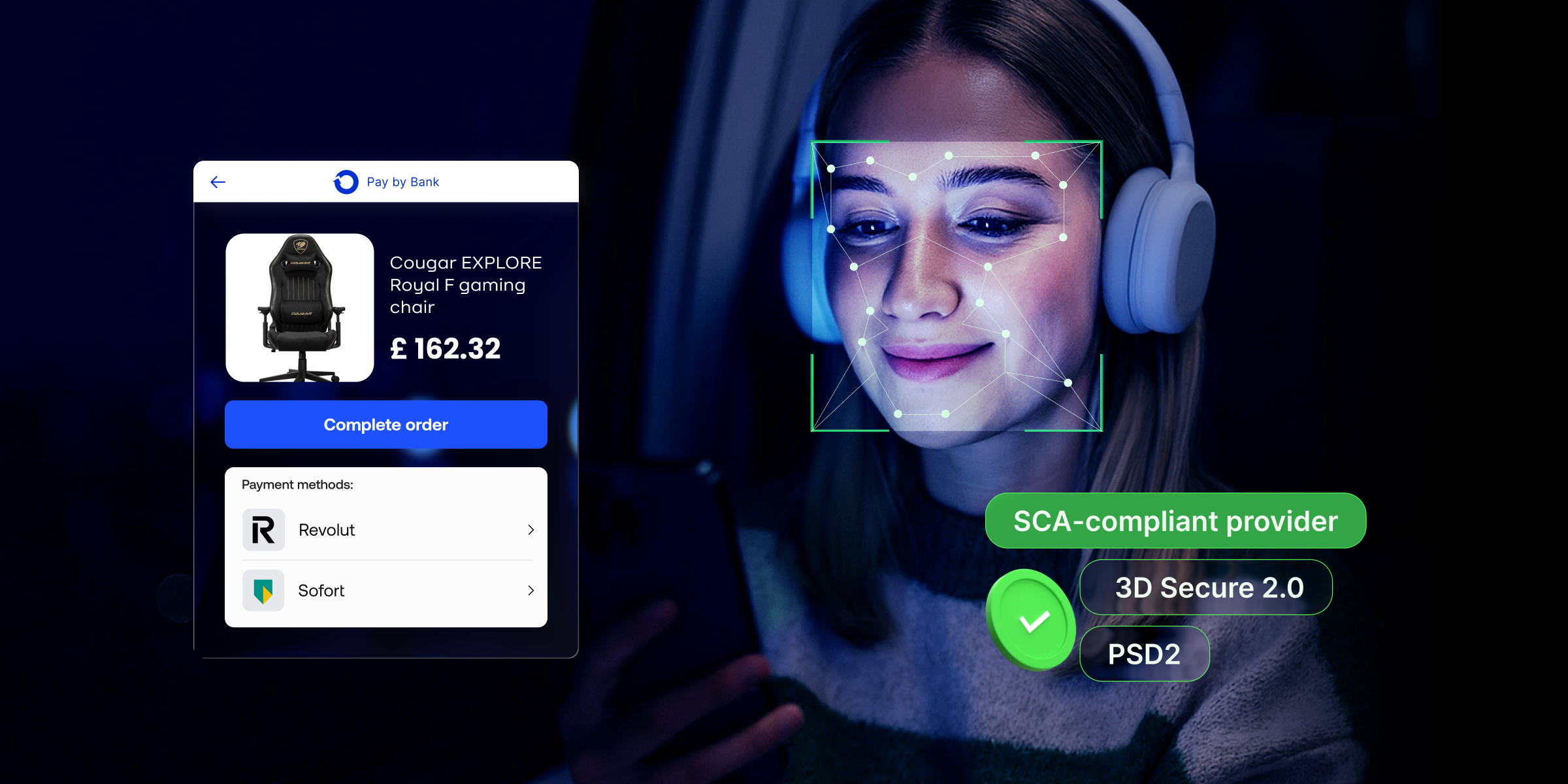
- Simple payment process: Make the payment process easy on mobile devices by integrating mobile wallets and Pay by Bank solutions, which allow customers to pay with just a few taps.
With Payop’s mobile checkout, your clients have a clear interface, minimum steps, and many payment options. One of them is Payop’s Pay by Bank. It allows customers to pay from their online banking without entering any details. Quick and secure!
#4. Diverse payment options at e-commerce checkout
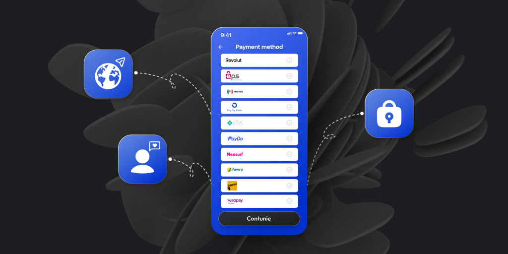
Customers have different preferences when it comes to payment methods. Offering various payment options can cater to a broader audience and reduce friction at e-commerce checkout. When selecting payment options for your checkout, consider the following:
- Customer preferences: Research your target audience and their preferred payment methods. Offering options that align with their habits, such as credit/debit cards, digital wallets, or alternative financing options, can increase conversion rates.
- Global reach: If your business operates internationally, ensure that your payment methods are accessible and popular in the regions you serve. Include local payment options or currencies that cater to specific markets.
- Security: Choose payment methods that prioritise security and are widely trusted by consumers. Integrating well-known and secure payment gateways can help build customer confidence and reduce the risk of cart abandonment.
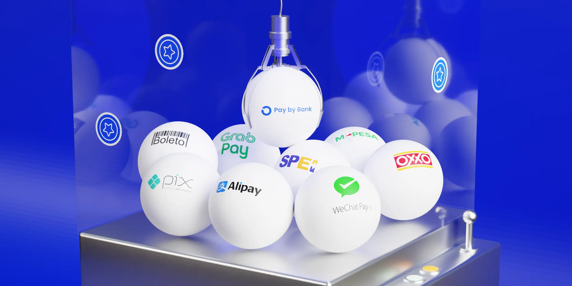
Payop grants you access to over 500 payment methods and 100 currencies. Now, your customers can choose options that suit them best. Result – reduces friction at checkout, higher conversion rates and fewer abandoned carts.
#5. Transparency and trust
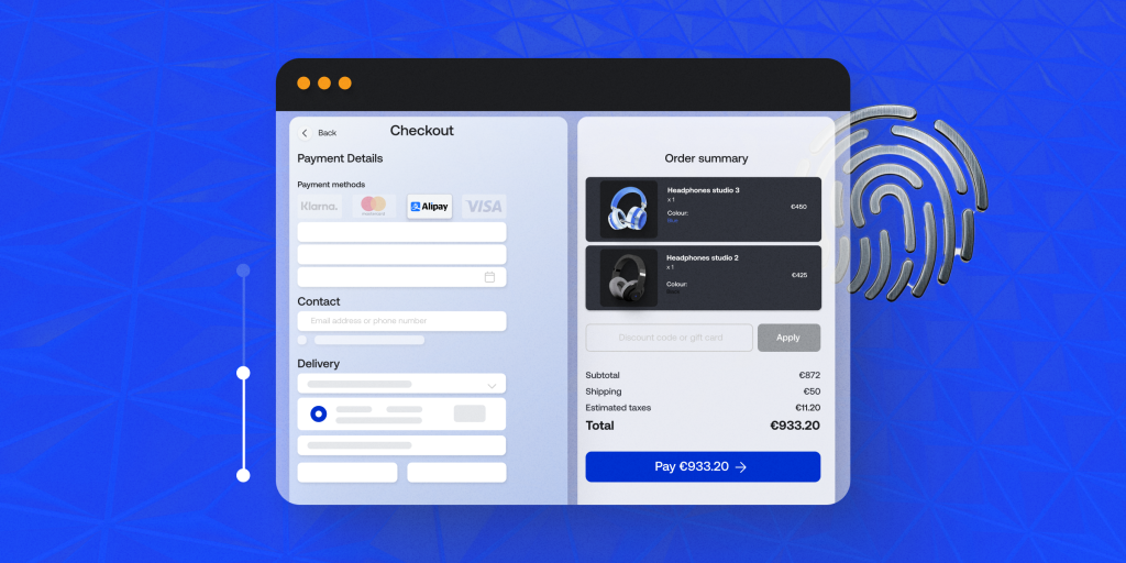
Building trust during the checkout process is vital. Customers need to feel confident that their personal and payment information is secure.
- Security badges: Display security badges and SSL certificates prominently on the checkout page to reassure customers that their data is protected.
- Transparent pricing: Ensure that all costs, including shipping, taxes, and any additional fees, are clearly displayed before the customer completes the purchase. Surprise fees at the final step are a common reason for cart abandonment.
At Payop, we do what we advocate. So, we employ the most advanced security and fraud prevention tools to keep your data and money safe.
Plus, you don’t have to worry about any hidden charges. We take fees only for successful transactions.
#6. Customer support
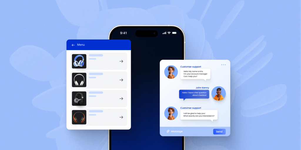
Sometimes, customers may encounter issues or have questions during checkout. Easy access to customer support can help resolve these concerns quickly and prevent cart abandonment.
- Live chat: Integrate live chat support on the checkout page to provide real-time assistance.
- FAQs and help sections: Include links to FAQs or help sections that address common checkout-related questions.
#7. Post-purchase engagement
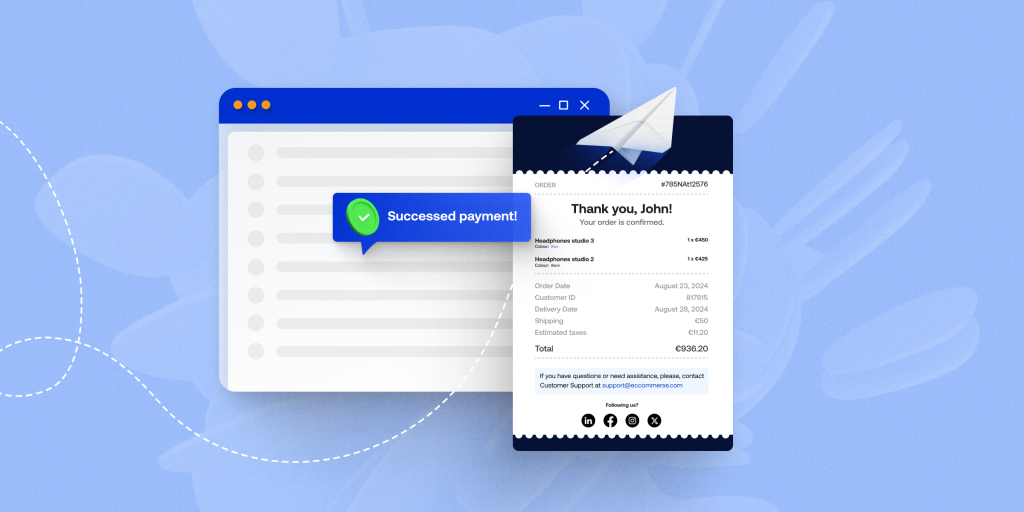
The checkout experience doesn’t end when the payment is complete. Post-purchase engagement can leave a lasting impression and encourage repeat business.
- Order confirmation: Send an immediate order confirmation email with all relevant details, including a summary of the purchase, estimated delivery time, and tracking information.
- Follow-up: Consider following up with customers after their purchase to gather feedback, offer discounts on future purchases, or provide personalised product recommendations.
Read about e-commerce payment trends in Southeast Asia.
Conclusion
There are a lot of aspects to work on. With Payop, you will have a reliable partner to check every point on the list.
We offer various integration options, including plugins, so you can easily connect Payop to your e-commerce platform without significant technical challenges.
Ready to improve your checkout? Contact our team at sales@payop.com.


