Aug 11
3 MIN READ


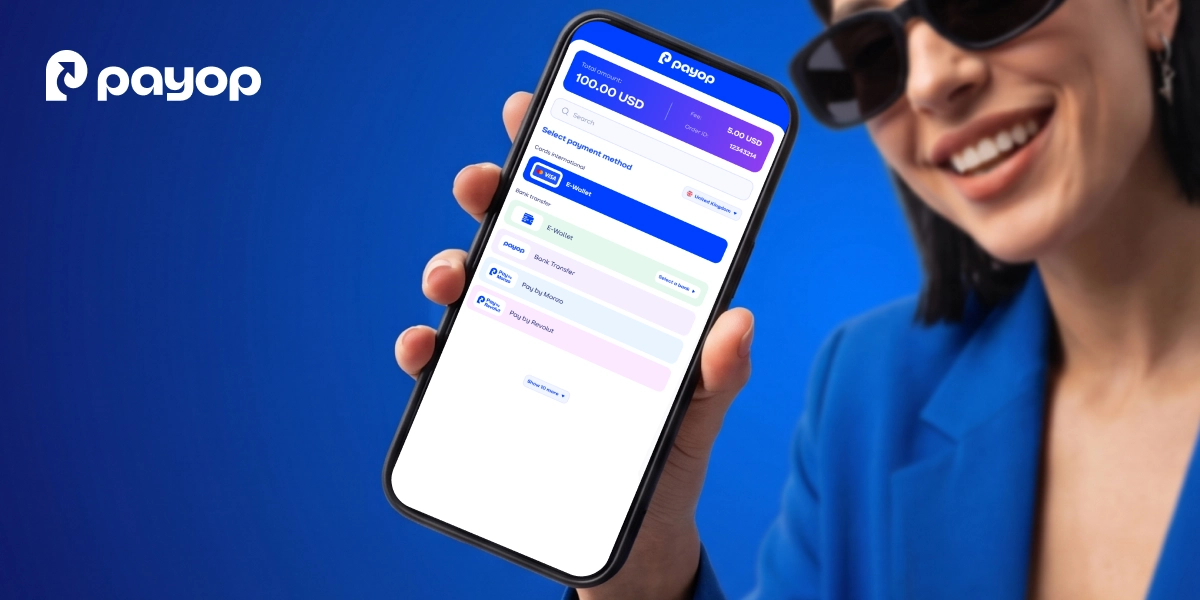
Payop has launched its redesigned checkout, bringing a fresh, colourful approach to online payments. The update goes beyond a new look: it's about making the payment experience more intuitive, engaging and enjoyable.
Most online checkouts are minimal and neutral. At Payop, we decided this tradition isn’t law, so we created our own vibrant, joyful design where contrasting colours naturally guide payers and make the process faster and more intuitive.
In this interview, two of our colleagues share their vision for the update. Nataliia Lukianova, COO, and Iryna Olishevets, Head of Customer Support – on what drives this innovation and what it means for payers.
Question: What changed in the new Payop checkout design?
Nataliia Lukianova: We’ve created a checkout that doesn’t look like the standard payment page people see everywhere. And that was exactly the point.
We challenged the usual approach and built something bold, distinctive and unmistakably Payop. The colours, the user experience (UX), the way payment methods are presented – every part of the checkout feels considered. This isn’t a routine redesign. It’s a completely new direction, and I’m glad that Payop is bringing it to the market!
Q: Are there any modifications in UX?
Iryna Olishevets.: We always try to find new ways to upgrade the UX. You’ll see that our new checkout makes the payment process even more intuitive and fast.
It’s possible thanks to a few things. First, we made tooltips clearer so users don’t have to spend too much time reading them. Second, our team placed payment methods in colourful blocks and added a hover-glow effect. Then, we made the payment summary much more scannable by using a larger font and a contrasting background, so users can instantly spot transaction details. Plus, we separated the total amount from fees and the Order ID so payers can check their summary at a glance.
Q: How else does the new checkout simplify the payment process?
I.O.: By tailoring payment method display. If a user’s region supports many options, we don’t show the entire list at once – just the most popular choices. This helps a customer pick their preferred option faster, without wasting time scrolling through a long list.
But if the suggested methods don’t suit them, a payer can always click 'Show more' to see all solutions available.
Q: What about payment methods? Are there any updates?
I.O.: Yes! We have great news – card payments are back! It means that, beyond plenty of alternative methods, merchants can offer customers more traditional options. Cards are still the top choice for many mature markets, so it’ll help merchants boost conversion in these regions.
Q: How do you feel about the new checkout?
N.L.: I’m so proud of what we’ve built! We didn’t accept that our checkout has to look like every other payment page on the market. Our team moved away from that standard and created something that feels truly like Payop. This is a big step forward for us, and I believe it raises the bar for what a payment page can be.
Overall, these improvements serve two key goals – bringing out Payop’s new brand identity and making our checkout a pleasure to use.